
Last Updated: November 3, 2026
Quick Summary
Sophisticated art for a modern living room is minimalist work with a limited palette, generous negative space and one clear idea per piece, such as a single hand-drawn line print. Scale it to two-thirds to three-quarters of the sofa width and center it around 145cm from the floor.
- Large art should span two-thirds to three-quarters of the width of the furniture beneath it.
- Center artwork about 145cm from the floor, or 15cm to 25cm above the sofa back.
- Match the frame to the room's metals or wood rather than to the artwork itself.
- In bright rooms, anti-glare glazing is usually the difference between art that reads and art that mirrors the window.
- Custom lake map prints range from 5 × 7 inches up to 20 × 29 inches and take two to three weeks before shipping.
Table of Contents
- Why Sophisticated Art Anchors a Modern Living Room
- Modern, Contemporary, and Abstract: Styles That Read as Sophisticated
- Large Modern Wall Art for Living Room Focal Points
- Living Room Art Placement: Height, Scale, and Proportion Rules
- Minimalist Wall Art for Living Room Warmth and Calm
- Matching Art to Your Color Palette and Furniture
- Framed Prints, Canvas Prints, and Other Formats Compared
- Personalized Minimalist Art Prints That Tell Your Story
- Lighting, Glare, and Preserving Your Artwork
- Shop Our Designs by Passion
- Frequently Asked Questions
Why Sophisticated Art Anchors a Modern Living Room
Sophisticated art is the element that turns a furnished room into a considered one. At ted&kate, we design hand-drawn, minimalist pieces for exactly that purpose: a single framed print that gives a modern living room its focal point and its personality. Trend reporting for 2026 points the same direction, with personalization, natural materials and restorative design named as the defining living-room themes in About Wall Art's 2026 interior trend review. What separates a polished room from a decorated one is rarely the sofa. It is the wall above it.
Below, we break down the styles, sizes, placement rules and formats that make sophisticated art for modern living rooms work, including the measurements most guides skip.
Modern, Contemporary, and Abstract: Styles That Read as Sophisticated
Modern art refers to work rooted in early-to-mid twentieth-century design principles: clean geometry, restrained color and an emphasis on form over ornament. Contemporary art describes work made now, in any style. Abstract art removes representation entirely and leans on shape, line and color.
For a modern living room, the styles that read as sophisticated share three traits: a limited palette, generous negative space and one clear idea per piece. Minimalist line drawings fit this brief better than almost anything else, because a single confident line carries visual weight without visual noise. For a city-life example of the style, see this San Francisco City Life Art Print. Photography and digital work are also moving into layered, maximalist arrangements, according to Big Wall Decor's 2026 trend forecast, though we would keep that instinct to one wall rather than the whole room.
Large Modern Wall Art for Living Room Focal Points
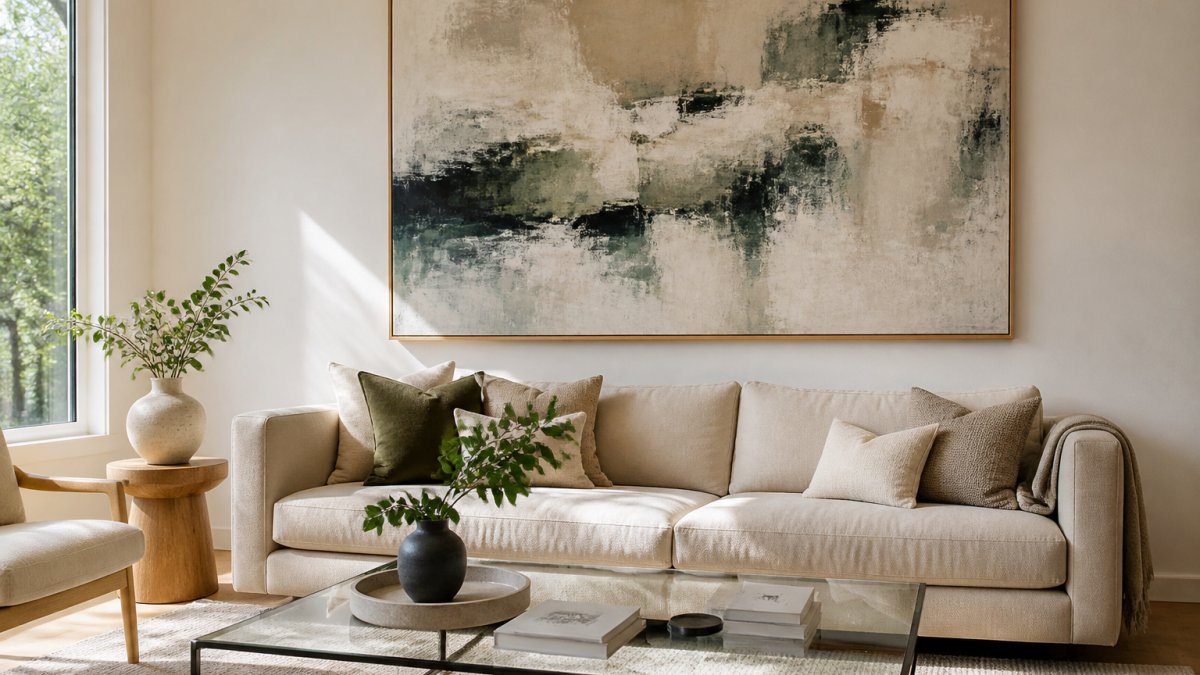
Large modern wall art for a living room should span roughly two-thirds to three-quarters of the width of the furniture beneath it. A sofa 200cm wide wants a piece between 135cm and 150cm across, or a grouped arrangement totaling that width.
Oversized artwork works because it gives the eye one place to land. A statement piece above the sofa does more for a room than five small frames scattered across the same wall. Scale is where most rooms go wrong: art that is too small makes the furniture look oversized and the wall look unfinished.
Hang the center of the piece at roughly eye level when seated, around 145cm from the floor, and keep the bottom edge 15cm to 25cm above the sofa back.
Living Room Art Placement: Height, Scale, and Proportion Rules
Living room art placement follows three rules: center at seated eye level, scale to the furniture, and leave breathing room. Get these right and almost any piece will look intentional.
- Height: center the artwork about 145cm from the floor, or 15cm to 25cm above the sofa back.
- Scale: artwork width should equal two-thirds to three-quarters of the sofa or sideboard below it.
- Spacing: leave at least 5cm between frames in a group, and 20cm to 30cm between the art and any adjacent wall or ceiling line.
- Balance: on an off-center wall, shift the grouping so its visual weight sits over the furniture, not the room's midpoint.
Visual balance matters more than symmetry. A single large piece offset above a low console often looks more composed than a perfectly centered pair.
Minimalist Wall Art for Living Room Warmth and Calm
Minimalist wall art for a living room works by subtraction: one subject, a muted palette, and space around the image. Warmth comes from the materials around it, not from the art itself.
Beige furniture, linen, natural wood and soft metals give a minimalist print something to sit against. A soft-border piece, where the image fades into the paper rather than ending at a hard edge, reads calmer than a full-bleed print. Browse this Massachusetts Soft Border Art Print for that calm aesthetic.
Watch out: an all-white room with a black-and-white line drawing can tip from calm into clinical. Add one warm texture, a wool throw or a wooden frame, to keep the room liveable.
Matching Art to Your Color Palette and Furniture
Matching art to a room starts with the palette you already have, not the palette you wish you had. The mechanism is repetition with restraint: art reads as intentional when it echoes one or two existing colors and introduces exactly one new note. Repeat three or more and the wall starts to look like a swatch book rather than a composition.
A practical sequence that most interior stylists follow:
- Audit in daylight. Photograph the room at midday with the curtains open and note the three dominant colors, usually the largest textile (sofa or rug), the largest hard surface (floor or cabinetry), and the wall. Ignore accessories; they change.
- Pick the anchor color. Choose the one of those three you want the art to echo. In neutral rooms this is usually the sofa or rug; in rooms with a strong wall color, it is the wall.
- Add one accent, not two. The art should repeat the anchor and introduce a single new hue. A beige-and-linen room accepts one terracotta, olive, or slate note; adding a second accent splits the eye and flattens the focal point.
- Match the frame to the room's metals or wood, not to the artwork. A black frame in a room with brass and oak reads as a mistake; a thin oak or warm brass frame lets the art do the talking. This is the single most common framing error in modern living rooms.
- Test at hanging height, in the room's own light. Tape a paper template the size of the piece to the wall and live with it for a day. Wall color shifts artwork more than any other surface because it sits directly behind the piece and bounces light onto it.
Undertones matter more than color names. A "warm white" wall with a cool grey-blue print will make the print look dirty; the same print on a cool white wall reads crisp. Most practitioners find that pulling the art's undertone from the room's largest textile, warm beige, cool grey, greenish linen, prevents the mismatch that color names alone cannot catch.
Neutral rooms give the most freedom, but not unlimited freedom. A beige sofa, linen curtains and a glass coffee table will accept almost any accent, which is why neutral rooms are the easiest to build a collection in. The constraint is value contrast: a very dark piece on a very pale wall becomes a hole in the room, and a very pale piece disappears. Aim for the art's darkest tone to be at least two steps darker than the wall, and its lightest tone at least one step lighter than the sofa.
Watch out: repeating a strong accent color from a cushion or throw directly into the artwork often looks staged rather than collected. Let the art introduce its accent and let the textiles answer it, not the reverse.
If you want to tailor a piece to your space, a customizable golf course art print lets you choose the number of holes, the print size and the course name and location.
Pinehurst No. 2 Golf Course Art Print | North Carolina Golf Wall Art →

Framed Prints, Canvas Prints, and Other Formats Compared
Framed prints and canvas prints differ in weight, cost, how they age, and how easily they can be changed later. The format decision is really three decisions stacked: the print surface, the framing, and the glazing.
| Format | Best for | Watch-outs | Relative cost |
|---|---|---|---|
| Framed print | Line drawings, small and mid-size pieces | Frame choice can overpower the art; glazing adds cost and weight | Print plus frame plus glazing |
| Canvas print | Large, soft or photographic images | Can look flat under direct light; harder to reframe; edges need a gallery wrap or floater frame | Often one all-in price |
| Unframed print | Budget-conscious buyers, gallery walls | Needs framing before hanging; edges are vulnerable to handling | Lowest upfront |
| Original artwork | One-off statement pieces | Harder to size to a specific wall; insurance and UV care matter more | Highest |
The framing trade-off is where budgets actually break. A print that costs a little and a frame that costs several times more is a normal ratio, not an upsell. The frame is what the eye reads first at living-room distance, so a cheap frame undercuts an expensive print faster than anything else in the room.
Glazing is the hidden variable. Standard glass is clear and inexpensive but reflects room light directly. Anti-reflective glass and acrylic reduce glare at the cost of a slightly softer image and a higher price.
Canvas behaves differently over time. Canvas sits flush to the wall and needs no glazing, which makes it the lowest-fuss large format. But it stretches, it can sag on very large sizes, and it is harder to reframe if your taste changes.
Sizing changes the format math. Above a sofa, a framed print in the two-thirds-to-three-quarters width range is the safest choice because the frame gives a clean edge to a line drawing.
Watch out: buying an unframed print to save money and then choosing a frame in a hurry is the most common route to a piece that never gets hung. Budget the frame at the same time as the print, and decide the glazing before the moulding.
Our prints are sold unframed, so you can choose a frame separately. Budget for framing as part of the purchase, not as an afterthought, and treat glazing as part of the artwork's long-term care rather than a line item to cut.
Personalized Minimalist Art Prints That Tell Your Story
Personalized minimalist art prints turn a memory into a piece of decor: a course you played, a lake you return to, a race you finished. The format works because the subject is specific and the treatment is restrained.
The practical advantage is fit. A Customizable Home Sweet Home Art Print lets you order a personalized minimalist piece of your own. A custom piece can be drawn to your wall's proportions and your room's palette, which a stock print cannot. Our custom lake map print is hand-drawn to the shoreline of your chosen lake and includes the name and location, with sizes from 5 × 7 inches up to 20 × 29 inches. Custom illustration work is included in the price, and production takes approximately two to three weeks before shipping. Order early if the piece is a gift with a date attached.

Lighting, Glare, and Preserving Your Artwork
Glare is the most common reason a good print looks cheap. Position art away from windows that receive direct sun, or hang it on a perpendicular wall so light rakes across rather than hits it.
- Keep prints out of direct sunlight; UV exposure fades pigment over time.
- Use anti-glare glass or acrylic in bright rooms.
- Add a picture light above the piece rather than a lamp below it.
- Avoid hanging art directly above a heat source or in a steamy room.
- Dust with a dry, soft cloth; never spray cleaner onto the surface.
Accessibility matters here too. Hang the most important piece where it can be seen from a seated position, and keep a favorite smaller work at a height a child in the house can actually enjoy.
Shop Our Designs by Passion
A sophisticated living room is built one considered piece at a time, and the wall above the sofa is the right place to start. Our collection is hand-drawn in-house, from Pinehurst No. 2 golf course art prints at $25 to fully customizable golf course art prints at $30, each sold unframed.

Frequently Asked Questions
How do I choose sophisticated art for a modern living room?
Start with the room's dominant palette, then pick one piece that repeats one or two of those colors rather than introducing new ones. Choose a scale that fills roughly two-thirds of the wall width above your sofa, and keep the frame finish consistent with your metals or wood tones. Fewer, larger pieces usually read as more sophisticated than a scatter of small ones, and a single oversized abstract or minimalist line drawing often does more for a modern room than a busy gallery wall.
How large should wall art be above a sofa?
A common guideline is to size the art to about two-thirds of the sofa's width, leaving 15-25 cm of breathing room on each side. Hang the bottom edge roughly 15-25 cm above the sofa back so the piece connects to the furniture instead of floating. For a 2.2 m sofa, that points to artwork around 1.4-1.5 m wide, or a grouped pair that reaches that total width.
Can minimalist wall art for living room spaces feel warm rather than cold?
Yes, and the trick is texture and tone rather than more objects. Choose warm neutrals such as oat, sand, or soft clay instead of stark white, pair the print with a natural wood or thin brass frame, and layer it against a linen sofa or a textured throw. A hand-drawn piece with visible line variation, like a course or shoreline illustration, adds warmth that a flat geometric print often lacks.
Where should art be placed in a living room?
Center art at roughly eye level, around 145-155 cm from the floor to the middle of the piece, so it reads comfortably whether you are standing or seated. Anchor the largest piece on the main sightline, usually the wall opposite the entry or above the sofa. Smaller works can sit on a console or shelf, but keep at least one clear focal point rather than spreading art evenly across every wall.
How do I choose art that matches my living room colors?
Pull one or two colors from the room, not five. If your palette is beige furniture, linen, and natural wood, a print with soft neutrals plus a single muted accent will look intentional. Bold designs work when the room is otherwise quiet, and calming colors work when the furniture already carries pattern. Test the match by holding a fabric swatch next to the print in the room's actual light before you commit.
How can I create a cohesive gallery wall in a modern living room?
Pick a single thread, such as one subject, one palette, or one frame finish, then vary only the sizes. Lay the arrangement on the floor first and keep consistent gaps of 5-8 cm between frames. Center the whole group at eye level and keep the outer edges aligned to a rectangle so the composition feels curated rather than accidental. A gallery wall suits a collection, while one oversized statement piece suits a room that needs calm.
Will personalized minimalist art prints look good in a modern home or too crafty?
The result depends on the drawing style and materials, not on whether the piece is personal. A hand-drawn illustration with clean lines, restrained color, and high-quality paper reads as refined, while heavy borders, novelty fonts, and busy detail can look homemade. Choose a piece where the personal element is the subject itself, such as a course layout or a lake shoreline, and let the surrounding design stay quiet.
The hardest part is not choosing a style. It is committing to one piece large enough to anchor the room. ted&kate designs custom, hand-drawn prints with a minimalist aesthetic, made in-house on high-grade materials, so the artwork you hang is personal rather than generic. Start with the wall you look at most, choose the memory you want to see every day, and build from there. Get started with ted&kate and give your living room a focal point worth keeping.
